I did not have a firm idea of what I wanted to do with this one, other than I wanted to show a field of yellow flowers. I could have used the masque pen to keep areas clean for the yellow water color, but instead I chose to paint the field green and use pastels to add the flowers. I blotted the pastel with watercolor to give it a more blended look.
It is simple, but I think it works.
Pastel over Watercolor on 120lbs paper 9x12
Spring is here. . .Finally. Was it just me or did it feel like Spring was never going to arrive? It was not a particularly bad Winter but even I, who does enjoy cold weather, was done-al la-done-done with the cold. It is time to be outside wearing shorts and sandals.
Watercolor on 120lbs paper 9x12
I woke up this morning feeling inspired. The entire house is clean, like we just moved in clean, that is how clean it is. The art room looks amazing and was calling to me. It is so wonderful to be surrounded by paints and pastels and racks of paper and art board and pads and all the supplies I have been gathering for the last decade.
I am very satisfied with the wet-on-wet technique used on the field. I even held up the painting so the water and color could just flow where it wanted. It makes an interesting effect.
And let me say, it took everything I had to go all Bob Ross on this painting and add the dark tree in the foreground. The painting needed something interesting up close, but it was very hard for me to paint over what I would normally call a finished painting. I think this means I am growing.
Watercolor and pastels. . .I have seen it done and have always wanted to do it but I have never been able to pull the trigger. I get to the point in a watercolor painting where I want to add pastels, really add pastels and I cannot.
Pastel over Watercolor on 140lbs paper 6x4
I did this quick sky study with the express intent of going crazy with pastel over the top of the watercolor. This was a liberating experience. I rather liked it.
I did this late last night. I was tired and therefore was not over thinking the process as I am oft to do. The results were quite satisfactory; I wanted the picture to have a bit of raw, cold day of autumn feel. You can be the judge of whether that was successful. This also marks the first time I added figures to a painting. Will do more of that in the future.
Watercolor on 120lbs paper 9x12
Why Dex? Probably because I had just watched an NCIS about a bomb sniffing Marine dog name Dexter (short for Poindexter).
Something small and quick, yet incorporated both wet on wet technique and masque-pen. The goal was also to make the painting more colorful than the original subject matter. I think I accomplished what I set out to do And it was fun to complete.
Watercolor on 140lbs paper 10x7
Wanted to practice painting clouds. . .I think this was a good exercise.
Watercolor on 120lbs paper 9x12
This was painted with no crutches, no pen and ink to delineate different areas or the use of visible pencil lines to show detail. This is 100% watercolor, with a bit of pastel added at the end to enhance certain areas of the sky and grass (which I do not consider a crutch). I think I was able to nail the musculature of the hind limbs with washes and a thin brush for detail.
Watercolor on 140lbs paper 9x12
For those who know me, know that horse were a central part of my life for almost a decade. I do not work with them any more, but sometimes people contact me about my old work. Back in April of last year I had the opportunity to visit Kentucky and took in some races at Keeneland. This is the photo from the back of the racing program. I took many of my own at the several farms that I visited during that trip. A handful of those are in the queue waiting to be painted.
Thus ends the streak of the Three Legged Horses. Thanks Cone.
Leinil Francis Yu is one of my favorite comic book artist and I was psyched to hear he would be joining Mark Wade on the Marvel Now book, Indestructible Hulk. Not since Paul Pelletier took over the book several years ago have I been so excited about oncoming Hulk artist. And let me say, Yu has not disappointed with his detailed, hyper-kinetic style.
Pen & Ink/Watercolor on 140lbs paper 10x7
This swipe is from the inaugural issue and really set the stage for the book thus far. I loved this splash page and had to try it. I simplified the background quite a bite because I was more interested in trying out my watercolor pans.
My previous watercolors on top of pen & ink were done using watercolor pencils. While I liked the final results, I was never able to manage the blended colors that I so wanted to achieve. For this picture I employed the cotman watercolor pan set, and the result was much more freer and loose. I really enjoyed the process.
Here is the picture in black and white after I inked it. I used micron 05, 08 and brush to ink the drawing.
Well, they all cannot be winners. It started out by putting too much water on the paper and then choosing two blues that were far too similar for the contrast I wanted. It went down hill from there. Not having a clear idea of what colors I wanted to use for the polar bear did not help either. I did the initial pencil sketch of the bear back in 2006.
Watercolor on 140lbs paper 14x11
I think if I had not decided to use stipple on the bear, I might like this better. That said, I am happy to have finally finished this one. All in all, it did not come out too badly.
A friend of mine has been showing me photos of the magnificent view from their house at sunrise. Not a bad way to start the day. I am very happy with how this turned out, especially the wet on wet look of the water (something I have been struggling to master).
Watercolor on 140lbs paper 9x12
This was the first painting where I used a masque pen to block out shapes. Technically, since the clouds were darker than the morning sky, I could have painted on top of it once the paint dried. I had been meaning to try the pen and this was as good an opportunity as any. Below is the painting when I pulled off the latex.
I had the
incredible opportunity to spend the week of New Years Eve in Key West.
While staying at our friends time share, I took advantage of the
wonderful weather to do some sketching. With these three sketches, I am
now past the halfway point of my goal of actually finishing a sketch
book.
Watercolor on paper 9x7
There was an
enchanting swing by the pool that overlooked the ocean. I never did
take advantage of the swing, but many people did.
Watercolor on paper 9x7
The
first painting that I did down in the Keys. This is the view from the
balcony of the windward side of the island that I woke to every
morning. We ate breakfast every day sitting out here, watching the
joggers, cyclists, boaters and wavecraft drivers. I completed this in
about 10 minutes, just a quick sketch in ink and a rough watercolor. It
was the perfect way to start the trip.
Watercolor on paper 9x7
The
pool at the complex was always filled with clusters of sun worshipers
avoiding the northern cold. In previous trips, I had contemplated many
times sketching down here, but never sketching this scene. I always
felt it was a bit more complex than I was capable of doing. But when
the mood struck me, I just went with it and became lost in the process.
There is nothing more "zen" for me than painting in this matter.
I
think this trip was a major success in many ways. Sun, watercolor
& rum runners is Big Medicine. And to top it all off, I met Guy
Fieri at the airport. A great way to end a great vacation.
I was unable to get out during or after Hurricane Sandy to paint or take photos but I was able to paint a picture from a photo reference. I wanted to make the shadows in the foreground darker, but I had to finish the painting by candle light. It was difficult to tell how dark the area actually was.
Watercolor on 120lbs paper 9x 12
In October of 2010 I had the opportunity to tour West Point and we took many photos, several of which I hope to paint. Of the many incredible vistas, I was most taken by the scene of the American Flag on such a historic campus. The grey flags made the whole scene seem even more solemn.
I am beginning to fall short of my goal of one painting per week, but I think this one gets me back on track.
I have been wanted to do a painting with a different color scheme than the last few and with the onset of Autumn, I have lots of choices. This is from a photo reference but I hope to be able to paint on sight in the near future.
Watercolor on 140lbs paper 9x12
I definitely love the fall, with its beautiful colors and crisp weather (and of course football). I am planning on doing a pastel painting in the near term as well but these quick watercolors have been a breath of fresh air for me.
Our old shed sits in the corner of our yard and needs to be moved. But to where is the question we are struggling with. It is time to landscape the yard and add a patio and this old shed is sitting right dab in the middle of usable space. Most likely we will use it to screen off the front yard. . .just not sure.
Watercolor and ink on 140lbs paper 9x12
I have wanted to paint this scene for sometime, as I love how the dynamic shadows from our many trees flit throughout the yard during the day. I tried something different with this one. With all the other previous watercolor, I drew the picture (with varying level of details) in pencil, then painted. I only inked the drawing from Munich after the watercolor was complete, leaving the paintings of Hawaii as watercolor only. This time, I drew a rough picture in pen and ink, only using pencil to find my vanishing points and keep the picture's proper perspective. The rest was free hand using a micron 05. I can not tell you how satisfying this one was to complete. I am very satisfied with the finished product. This is more along the style that I was picturing for my "sketch crawl" pictures on location.
Mokoli'i, also known as Chinaman's Hat, is an iconic basalt island off Oahu that has been used in many popular films. The Kualoa Ranch (aka The Jurasic Park tour) uses it on its logo. While on vacation, we did the four different tours at Kualoa including the Secret Island tour. I took my paints, but did not paint. However, I did take several (okay, lots and lots of) photos that I hope/plan to paint. This is the first I hope many of paintings from those reference photos I took.
Watercolor on paper 9x12
I am not completely satisfied with this one and almost feel it is a step back in terms of technique (not every picture is going to be a winner; still learning watercolors after all). I think the trees and sky, and even Mokoli'i itself is not bad. The water, however is rather flat and lacking (I was going to try using salt as a way to make it more interesting but forgot). Perhaps I should try and rework it but I think I would rather move on to another subject, especially doing another painting en plein air.
Vacation. What a wonderful thing. During my first ever trip to Hawai'i and the island of Oahu I was able to stick to my goal of completing a painting. In fact, I was able to do two watercolor paintings.
Watercolor on paper 10 x 7
This first painting, completed in about 40 minutes, is of the famous Diamond Head crater that overlooks Waikiki beach. As I painted, I was amazed at how the ever changing cloud cover altered the look and feel of the mountain. The clouds cast deep shadows on Diamond Head as they passed over and revealed deep craps when they floated by.
I sat balanced on these rocks, with my paints and pad on my lap. At one point, I had two paint brushes chomped between my teeth. It has to be one of the most precarious sitting positions that I have ever painted by. As I was finishing, the tide was coming in and starting to splash me. If I had not finished when I did, I would have had to wade in the ocean to make it back to the beach.
Watercolor on paper 10 x 7
This second painting is of the view from my hotel room. I sat on the lanai, once again amazed at the wonderful clouds that appeared to be hooked to the mountains by gossamer strings. Bob Ross would definitely love these happy little clouds. This painting took about 45-50 minutes and shows, I think, my own personal evolution in painting with watercolor. The colors are much less flat and much more dynamic than painting in Munich. I choose to include the buildings, to one show scale and two because I am so horrible at painting buildings (this was a personal challenge).
There are many amazing old world buildings in Munich, displaying grand architecture and boasting rich histories, any of which are a source of artistic inspiration. Alas, I only saw them during cab rides to and fro the convention center. Therefore, in order to keep my goal of one painting/drawing per business trip, I had to go with what I had. . .the view outside the Eurostar Grand Hotel (I think this building, across the street from my hotel, was actually a prison).
I did the rough drawing while sitting in my hotel room, looking out the window, in between various business meetings, emails and recordings. I briefly entertained the idea of venturing into the city proper, but it rained the only free day I had. The painting was finished in the States, sitting outside of a lakehouse with its own majestic views (which, ironically, I neither drew nor painted. . .go figure).
The piece is rough, and the colors of uninked version rather flat yet at the same time satisfying and playful in their own way. I am still learning and relearning how to paint in watercolor, and figuring out how to mix colors, something I do not really do in pastel. The scribbled leaves were a great deal of fun.
I was stuck in Chicago for an extra day (I hate work travel that extends over the weekend but such is life). Since I had a pretty open schedule on Saturday, I decided to go to Blick Art on South State Street and bought a small travel watercolor set, pad and brush. Taking advantage of the beautiful weather, I went to one of the parks by the Chicago Art Institute and painted one of the trees.
10x7 watercolor on paper
Not bad for an impulsive Saturday afternoon. Below is a photo of the tree I painted and the sign outside the park.
Not much movement on any real paintings (other than I have been getting all my watercolors together; apparently I have bought several sets [all unopened] in the last 5 years) but I did have the opportunity to paint rocks with my young niece. She was very excited to finally paint with me. I did the green dinosaur with the pink spots and she did the rainbow and flowers.
Truth be told, this was probably the most fun I had painting or "doing art" since college. We are now on the look out for more suitable river rocks to paint (even though we can buy more at the store).
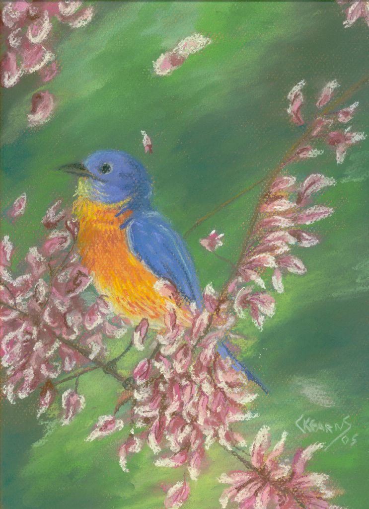
So, I finally finished a pastel painting! I had not realized, but looking back, the last pastel painting I did was in 2005. It was the Song Bird in Blue. How did that happen? I have no idea but I am happy the long drought is over. As with most things, this took longer than I had expected but I think it turned out well. I am very happy with the final product.
This picture, which is a replication of the cover from Hulk #104 (June 1968), was my favorite comic book issues growing up. I must have read this book hundreds of times until it was a battered, beat up mess. I just loved the fight between the Hulk and the Rhino and how the Rhino, despite being severely over matched never gave up. The Hulks ends up dragging the Rhino away from a burning jet liner that is about to explode. Just a spectacular issue. Growing up, I had always thought the issue and cover were drawn by Herb Trimpe (an underrated and under appreciated artist who had a great run on the Hulk). However, when I went searching for a reference picture to paint I discovered it was drawn by amazing Marie Severin. She was the Hulk artist as the book transitioned from Tales to Astonish to Hulk proper (with issue #102).


.JPG)
.JPG)